Client
Project Type -
Title Sequence
BBC2 for the program "The Wrong Mans" - British broadcasting company
Skills Involved
-
Competitive Research
-
Persona Development
-
Mood Boarding
-
Storyboarding
-
Pre Production
Project Description
The Wrong Mans is a BBC2 comedy thriller about two kind hearted idiots who get wrapped up in dangerous situations filled with offences, conspiracy and manipulation. I created the beginning title sequence keeping to a thirty second limit to target BBC2’s 16-24 year old audience to gain back its viewers from competitors on demand services and build excitement before the show.
Footage from the series

Graph indicates that BBC's on demand service is losing it's 24 and under audience to alternatives
(Ofcom’s annual report on the BBC: 2018/19, 2019)
Shows BBC is losing its audience from 54 years old and younger, but more worryingly the biggest decrease is 16-24 year olds which can be seen across all channels.

(Ofcom’s annual report on the BBC: 2018/19, 2019)
Competition

Plebs
Modern comedy about three average guys living in ancient Rome times trying to improve their living situation and having a tough time getting laid.

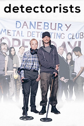
Detectorists
We see into the lives of two passionate detectorists that get mixed up in greed and lies for the hidden treasures below the surface.

Bad Education
Comedy showing the worst teacher ever, with behaviour worse then his pupils, focused more on romance with another teacher then educating his own class.

U Want Me 2 Kill Him?
A teenage boy’s time on the internet leads to troubling results from his decisions, based on a true story.

Death In Paradise
Drama about A UK detective that gets sent abroad to solve a murder in a glorious destination which he has a conflicting view of.
Connection
All competition tries to solve a problem either comically or seriously
Personas
24 year old worker in America
16 year old living in Poland studying in school
Peter

Tom

Joanna

21 year old from England studying in university
All Are Similar In
-
Watch BBC2
-
Watch alot of TV
-
Feels that BBC2 isn't for their age group but much older
-
Have busy lives
-
Without change, they might leave the channel
-
Feel the channel should use more celebrities that the younger audience can relate to
Are different in
-
Loyalty to the channel (Peter and Tom watch the channel consistently whereas Joanna only watches if she sees something she likes.
-
Joanna is a fan of James Corden
Mind Mapping

Mood Boards


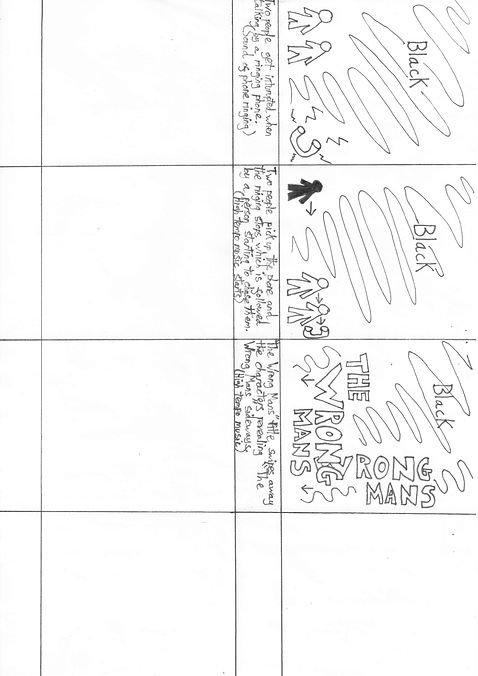
I gained feedback on my first storyboard explaining that I was being too focused on telling the story and that I should keep it mysterious and add in atmosphere and emotion. I agreed with the feedback and worked on this.
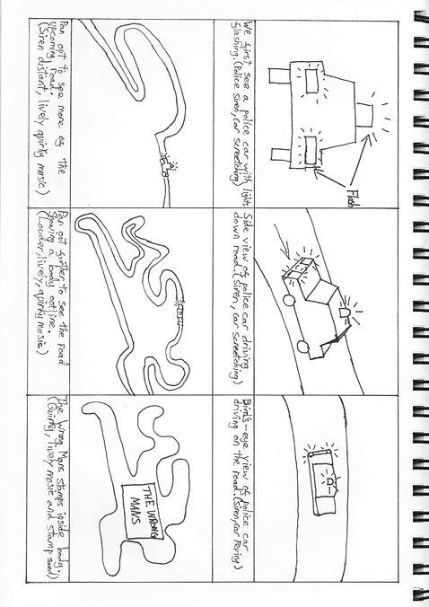
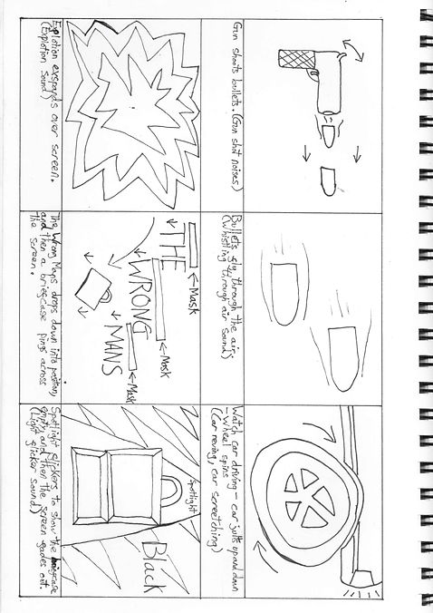
Storyboarding


My classmates told me that the person in black looked scary, as this was my intention I felt I needed to use this idea again. I also gained feedback that this looks somewhat comical as it appears to be like theatre, as this was the look I was going for I continued this.


I gained no feedback on these designs but I felt these storyboards had more depth then my previous attempts and wanted to continue doing so.
Inspiration
Catch Me If You Can
-
Uses slow quite music which gains tempo when the character is near to getting caught, which builds tension.
-
All scenes and characters are all in black with minimal detail as if they are silhouettes making the viewer curious as to what information they are missing out on.
-
Character hides behind rectangles as if they are walls that he can’t be seen behind helping him to change identity when he comes out the other side, this also adds tension and mystery and making the viewer question why is this character hiding and what has he done.
I thought this style is a good use of story telling while giving minimal information to the viewer, I wanted to add hiding with tempo and volume rising to build tension.
James Bond - DR.NO
This title sequence from James Bond uses a scope view as if your looking down a barrel of a gun which puts the viewer as the villain, this adds tension and mystery as we try and workout who is the villain and who is the character we are aiming at while also getting the viewer involved in the action.
From this point I waned to use this technique in my work as I want to create mystery and thrilling scenes. I felt that looking through the villains view would add depth to the titles.

With my next feedback I got told that I should make the sniper searching short as it was to long and that I should also add some effects to the video footage, one of which could be an outline to make it stand out while also downloading higher resolution footage. I agreed with this but as this was an experimental footage this was not a concern at this point.
As I explained to my team that I felt I needed to add in comedy but felt this was missing, I got further feedback explaining that I should test out other typography options and that I should keep all the video vector based, both comments I agreed with and continued.
At this stage I wanted to create more ideas that haven't been used before so that I didn't go down a narrow path. This storyboard I felt came away from the thriller, comedy drama theme and this is why I didn't pursue it, but would have been interesting to gain feedback, if others found anything that could have been used.


This video was another experimental attempt which seemed like two different title sequences put together and with running out of time before my next meeting I didn't get round to adding in all the sounds.
From this video I gained feedback that my thick and curvy typography worked well for a comedy theme and that my blacked out characters were mysterious but needed a white outline so they stand out better. With this feedback I would add this to my sniper video as this was the closest to what I was going for.
Further Inspiration
Red Lights
I think this title sequence does well in building tension and mystery by making type that is unsettled and music which is at a high tempo while also adding flashing disturbing images.
I wanted to replicate this with my title sequence with the type and characters disappearing while also having thrilling music but at this point I thought to keep the comedic side this music will have sound going up and down with a heavy beat less harsh sounds then red lights so that it isn’t taken to seriously.
North By Northwest
This title sequence uses typography to replicate the city life, and the hustle and bustle with the type stopping for a few seconds and then moving again. The type mainly moved up and down the building, I thought this was an interesting thing to experiment with.
The Pink Panther
I wanted to give a clue into the life of my characters which Pink Panther shows through the characters personality. I felt Pink Panther was a bit to obvious for what I was imagining.

Refining Footage
This video was made to combine all the elements from the other videos while also to give more clues into the characters, sadly though I had gone over the 30 minute time restraint so the Hitlist had to be cut.
At this point I wanted to refine my work, and from a discussion with my team I felt I could make the comedy moment of the "S" falling over more pronounced with sound effects which would tie up the theme I was going for. I also got feedback to try find another font which could possibly help give the sequence character and uniqueness.
Final Video
With this final video, I have highlighted “Created by” in place of “Written by” as this is seen to be a more important position. I also Zoomed in with the cross-hairs to the figure so that the figure is clear to see while also adding movement to the figure to make it seem more realistic.
I acted on previous feedback and changed the typography and and added sound effects to the "S" as well as tweaking it's movement to make it smoother.
Video Breakdown

Image 1
Introducing the city facades while also revealing titles which set the scene using animation principles such as follow through and slow in slow out.

Image 2
We begin to search the city through the eyes of a sniper building tension for the audience and intrigue.

Image 3
The sniper spots a light turned on by a silhouetted character, gaining mystery and making the audience question who is the good guy in the scene?

Image 4
A flash of light covers the snipers scope on the beat of the music making the audience question whether this was a gun shot and if it hit the target.

Image 5
We gain information of who the main characters are by their work cards spinning into shot, while also finding out their job titles.

Image 6
The title of the programme is revealed as if it was a hostage, while also knocking over the "S" giving the viewer an indication that there is also comedy giving them a breather before the episode starts.
I am currently seeking an opportunity to add to the success and development of an agency. I am open to working remotely anywhere in the world or locally around the London area
-
Graphic Design
-
Branding
-
Advertising
-
Print
-
Motion Design


